A3 · 2026 · Customer-facing
Buyer Portal
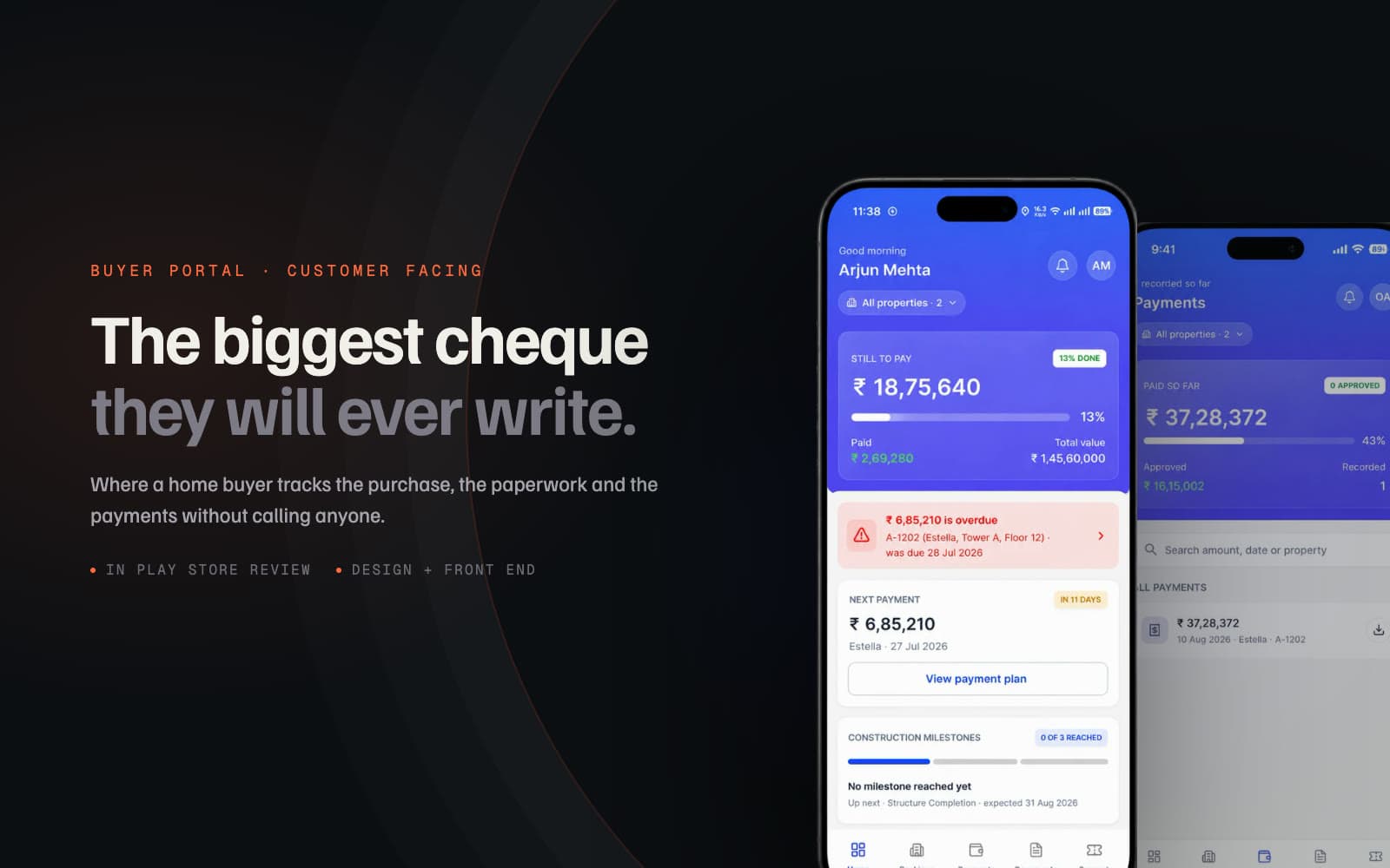
The other side of the same system: where a home buyer tracks their purchase, paperwork and payments without calling anyone.
Design, front end and QA: the flows, the document and payment views, the Flutter build.
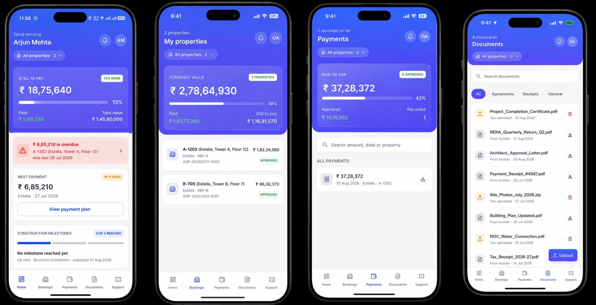
Eliminated routine status calls by putting overdue payments and milestone documents front and center, giving anxious home buyers instant clarity on their life's biggest purchase. Live on Play Store.
Listen to this one
0:29
The biggest cheque they will ever write
Home buyers committed life savings and then waited months in the dark, swamping sales teams with anxious phone calls and WhatsApp messages for updates.
Product Design Engineer: Designed UX/UI flows in Figma, built the mobile app front-end in Flutter, and conducted QA.
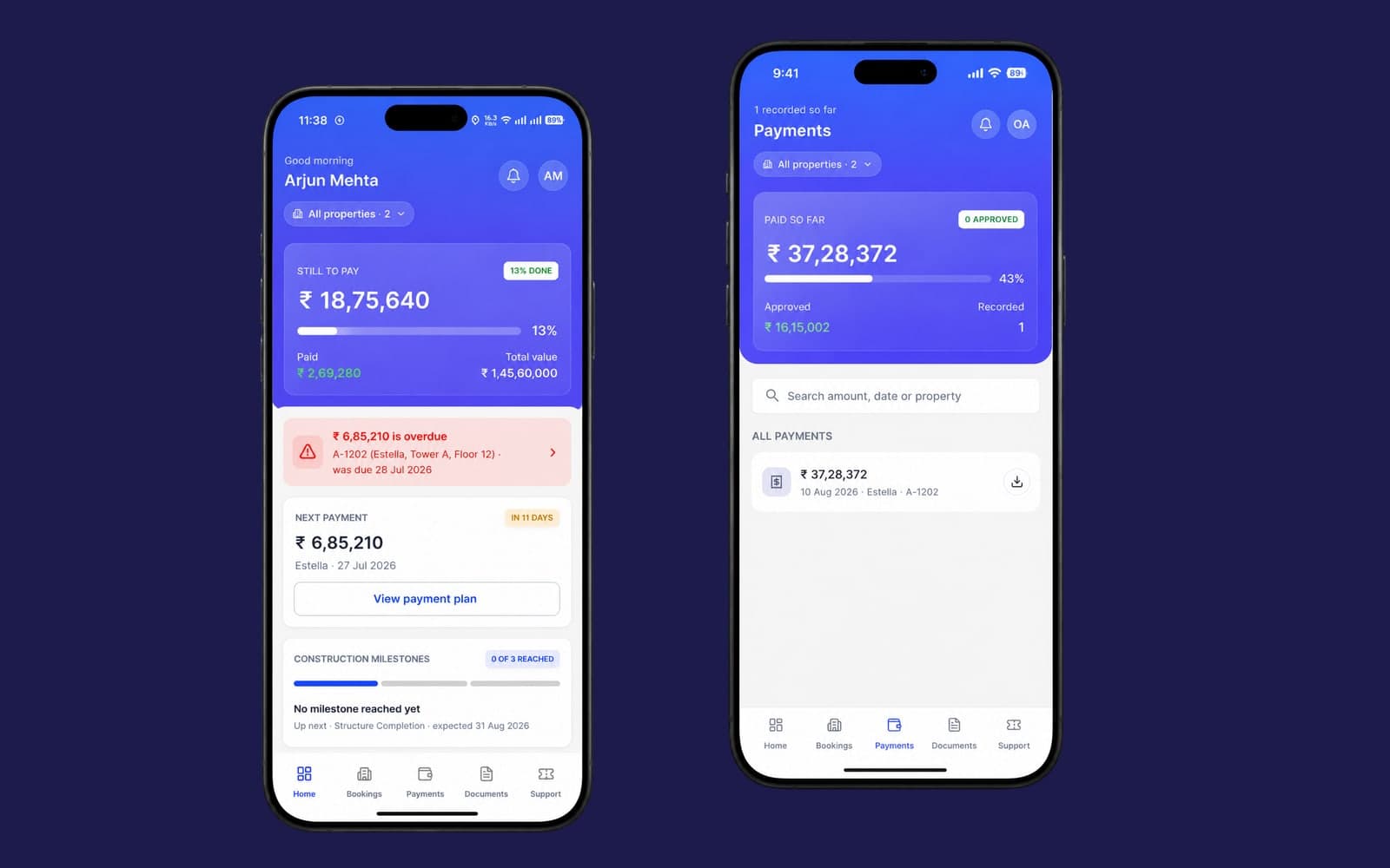
Designed a dedicated mobile app that surfaces the top two call-generating questions (overdue amount & next payment) directly at the top of the home view.
Eliminated routine status calls by putting overdue payments and milestone documents front and center, giving anxious home buyers instant clarity on their life's biggest purchase. Live on Play Store.
A buyer commits years of savings to flat construction and then enters a months-long silence. With no reliable self-service channel, buyers resorted to calling salespeople, chasing documents over WhatsApp, or visiting sales galleries in person for payment receipts.
The CRM and this app are the same business seen from opposite ends: the CRM is for internal staff working all day on desktops, while the Buyer Portal is for anxious homebuyers opening an app once a fortnight on their phones.
What a buyer sees: Four calm views
Mobile layout and construction tracking
Three product decisions that shaped the app
A native app on the home screen, not a web link
Instead of A mobile web page opened from an SMS or WhatsApp link
A link is something sent once and lost in chat history. An app on the home screen is something a buyer keeps. More importantly, native push notifications allow the system to proactively confirm received payments and slab progress before anxiety sets in.
After Enabled push notifications that inform buyers before they need to ask.
Full transparency on personal financial records
Instead of A narrow, simplified summary that hides detailed payment schedules
The instinct with anxious users is to show less information. But withholding information is what caused the phone calls in the first place. If an item concerns their money or their flat, it is accessible in the app.
After Buyers access complete demand notes, payment ledgers, and construction approvals independently.
Public verified facts, never internal CRM commentary
Instead of Exposing raw CRM note fields directly to customers
Internal notes written between sales agents and credit teams rely on shared company context. Read by a customer, that shorthand can easily cause confusion or mistrust. The portal displays verified status dates and figures only.
After Clean customer communication with zero risk of internal shorthand leaking.
Live on Play Store and next iterations
The Buyer Portal is live on the Google Play Store, giving homebuyers 24/7 visibility into their flat purchases.
- Built in a few weeks on top of the existing Briqhaus platform by myself (design, Flutter front end, QA) and one backend developer.
- Self-service transparency: Replaces anxious support calls with verified digital receipts and construction photo milestones.
- The next design challenge: Real-world construction delays. Currently, the app shows the current completion date, but communicating the reason behind a delay remains an important business and UX problem to solve.