B3 · 2026 · Web
Briqhaus site
Briqhaus was pitching software with no website to show. A large client meeting was booked, so the site had to be live before it. The public face of the platform the CRM and Buyer Portal sit behind.
Visit briqhaus.comDesign, copy, front end and back end in about a week: the argument, the page, and Payload CMS on Neon so marketing owns every word.
Live at briqhaus.com, built solo in about a week. Marketing edits every word of it without me.
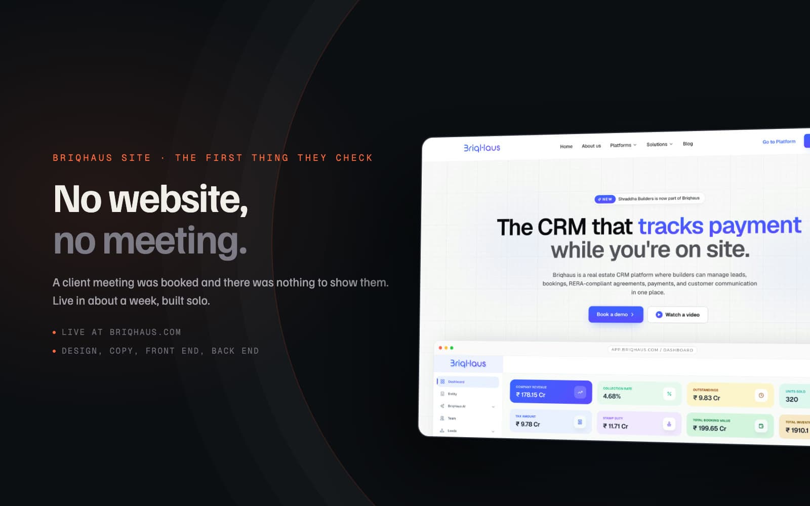
No website, no meeting
Briqhaus was pitching enterprise real-estate software with zero web presence prior to a critical enterprise client meeting.
Product Design Engineer (Solo): Copywriting, UX/UI design, Next.js front-end, Payload CMS setup on Neon Postgres in 1 week.
Structured the site as a single high-conversion page walking the exact workflow a builder experiences from lead calling to payment.
Site launched live at briqhaus.com before the client meeting; marketing updates content independently without developer intervention.
Briqhaus was entering enterprise sales conversations with nothing to show online. A major builder meeting was already scheduled, giving us exactly one week to launch a credible, high-converting digital storefront.
Rather than an abstract corporate pitch, the page was designed for Indian real estate builders on mobile devices at construction sites. It needed to land the value proposition in one sentence, demonstrate the product through real UI, and drive direct demo bookings.
The visual argument: Workflow over feature lists
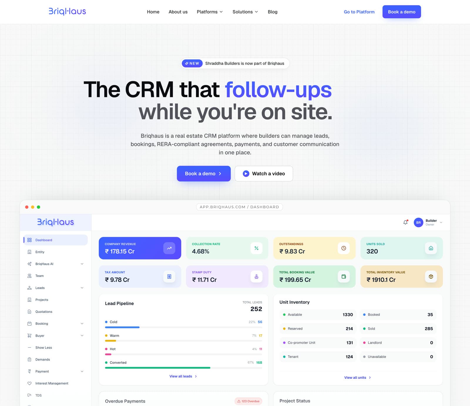
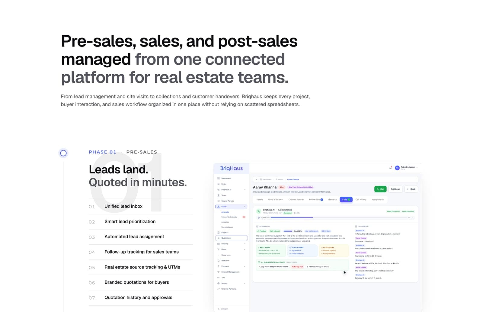
Initial exploration vs final pass
Core engineering & product decisions
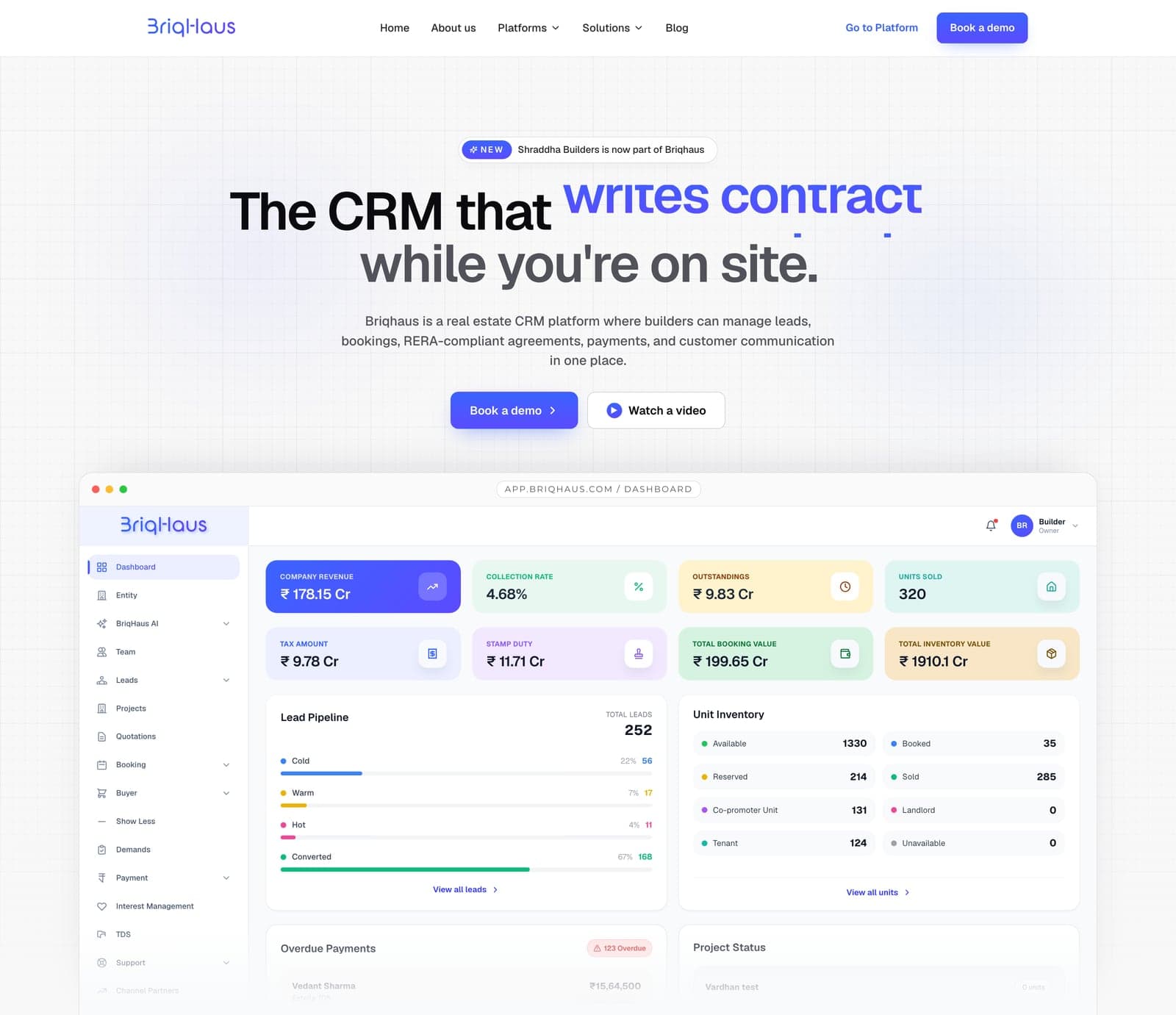
Walk the sequential workflow, do not list generic features
Instead of A standard SaaS grid of feature cards
Feature checklists force the customer to mentally assemble the product. Real estate developers think in concrete phases: pre-sales, inventory booking, document generation, and demand collections. Walking that exact journey proved the software understood their business.
After Builders immediately recognized their own operational stages from initial inquiry to banking.
Integrated Payload CMS on Neon Postgres from day one
Instead of Hardcoded static copy with CMS integration postponed
In an early-stage startup, positioning evolves every few weeks. Requiring a developer deployment for every copy edit creates an operational bottleneck. Wiring a headless CMS upfront took less than a day and freed engineering completely.
After Marketing updates headlines, pricing tiers, and client references without touching git or opening dev tickets.
Only show interfaces the production CRM can actually deliver
Instead of Fanciful concept mockups that over-promise features
Marketing hype that outruns product reality leads to broken trust during sales demos. Because I designed the underlying CRM, every UI asset on the marketing site came directly from production Figma components.
After Every screen shown on the marketing site matches the live demo a builder sees after booking.
Live deployment and working files
Built and deployed solo within seven days ahead of the scheduled enterprise pitch.
- Live at briqhaus.com: Fast, accessible, and responsive across mobile and desktop.
- Payload CMS: Powers ongoing marketing iteration on serverless Neon Postgres.